The Girl With The Dragon Tattoo (Fincher, 2011)
- The whole of the title sequence for this film is exciting and interesting due to a very different approach to the conventional thriller title sequence.
- It contains an array of extreme close ups of a woman covered in black paint to obscure our view of her face thus creating a very artistic shot and limiting character exposition. Enigma codes are created from the very start as we question, who are these two people being shown? as their faces are covered in black liquid throughout.
- Nearly ever clip used is CGI in this sequence. Large amounts of digital editing are used to create surreal images such as various wires connecting to woman's body and fire splashing onto the surface of an eye. These are very strange images and as we do not know if they either relate to the story or are included for pure visual pleasure the clip becomes even more engimatic and excitement is created through aesthetically interesting images.
- The setting in this sequence is very intriguing. A woman seems to be emerging from black liquid. This black liquid is used throughout the sequence to show flowing motion. The whole clip is very dark because of this liquid and the only colours used are black and hints orange occasionally, to create juxtaposition.
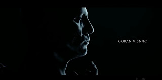
- What gives the sequence an impact and depth is the use of lighting applied to the otherwise black image. A beautiful silhouette is made with highlights over specific areas and does also create contrast (blacks and whites). This is very effective as the black theme is still dominant. This darkness used is often used in the thriller genre to create a sense of the unknown and the audience feels tension.
- The sound used in this sequence is called 'Immigrant Song' by Atticus Ross, It is a very fast paced sound track that generates a very adrenaline-rushing, rousing feel.
- The rhythm of the music dictates the rythym of cuts in this sequence and therefore fast paced clips are used. This also allows the audience to feel exhilarated and enticed to watch more.
- The titles introducing various names of interest are displayed in an artistic thin typography and are placed around the screen in areas of negative space they are quite small in comparison to the overall frame and are solid in structure. Presenting a uniformed manor. There are some individual letters that are different such as the 'M's' have a flick off the left side and the 'A's' are missing the centre line. The titles are coloured silver with a 3D look. The adds quite a modern feel.
- The main film title is very similar to the previous titles however it is much larger on the screen and is just off centre.The title is more interesting as the font is quite obscure due to the fact most letters are unfinished or the ends of each individual character are thinned off to a point. The less important words 'with the' are placed on top of each other in a font half the size. This is an interesting title that gives off a sophisticated feel.


No comments:
Post a Comment